SF Design Week Opening Night
SF Design week. It’s a tumulus time where every walk of design life comes together to share, explore, and better understand, “what’s new?”
It transcends networking and really helps to inspire and perhaps re-light that design fire. There were so many fascinating and stimulating components to the event that it’s hard to choose the biggest take away.
The event was hosted at Pier 27 which is the ideal location to walk through and experience the fascinating interactive components of the opening night.
The event hosted a variety of components; product booths, art exhibitions, interactive components, and wonderfully creative displays. Focusing on the products, there were countless innovations, and ideas that could help shape and even change design moving forward. The booth that stood out to me most as a UX/UI designer was the Famous booth.
They did a wonderful job describing the Famous tool and how it elevated existing programs like Sketch and Invision so that you could animate your slides directly in the program. This allowed for a far more developed presentation for the client which as designers know, can really help speed up the process when the design is pushed to dev. The future or even present of UX/UI is a difficult one to determine given the thousands of tools cropping up. That being said, it was fascinating and inspiring to see the new Famous platform and I hope to see the final product available soon.
Everywhere you looked there was an exciting new idea or product. I was especially taken by the Refold products, something I had only heard about but was so excited to see. The idea is simple, cardboard. When you have a flexible workspace and want to utilize the full potential of an office, refold provides affordable and environmentally friendly standing desks made out of cardboard. It’s no joke, this cardboard is tough. I felt like it’d be nearly impossible to destroy unless it was intentional but it’s really no less strength than a regular desk. It’s wonderful how it folds up and easily transported around too.
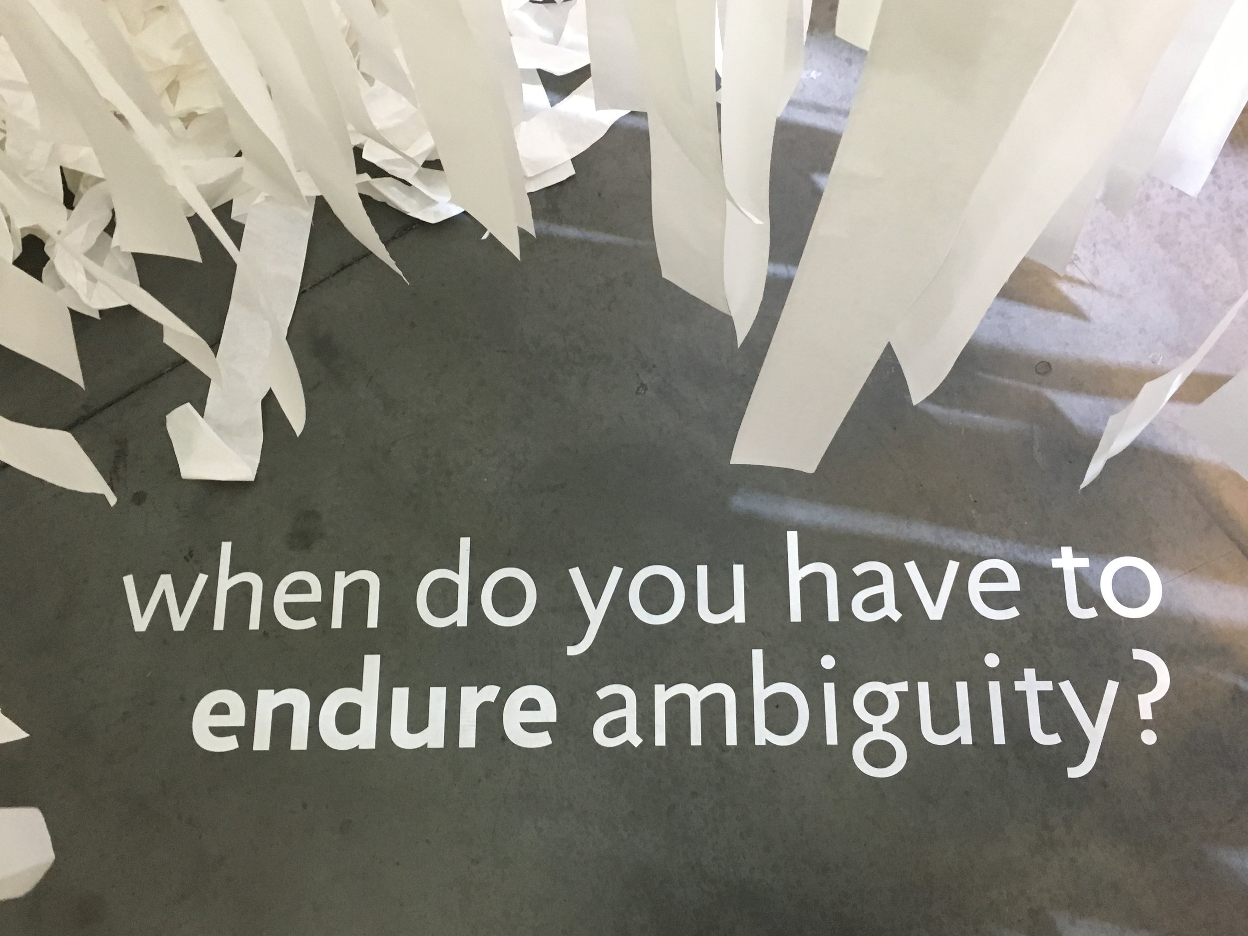
The most impactful installation was “Navigate Ambiguity.” The idea of the installation was to ask students what ambiguity meant to them and provide a personal metaphor. Some we’re heartfelt and introspective. Some related ambiguity to half-set jello. It was great to see the variety and also the importance of ambiguity, especially in design. It left me feeling empowered to take a thoughtful risk with a project, even if the outcome could provide an ambiguous result. Sometimes an open-ended design allows for the user to really project their own ideas on the product and it feels more personal and meaningful to them.
The event also had fun and delicious activities, like these phosphorescent backdrops, ideal for taking pictures at. Also delicious free beer provided by Fort Point Beer (perhaps the most beautiful beer can design) and lastly, plenty of food truck options.
Safe to say that I left SF Design Opening night feeling inspired and motivated. There was a lot to take in, and I only just covered some highlights.
Feel free to check out more of what’s going on at SF Design Week as the party continues.


