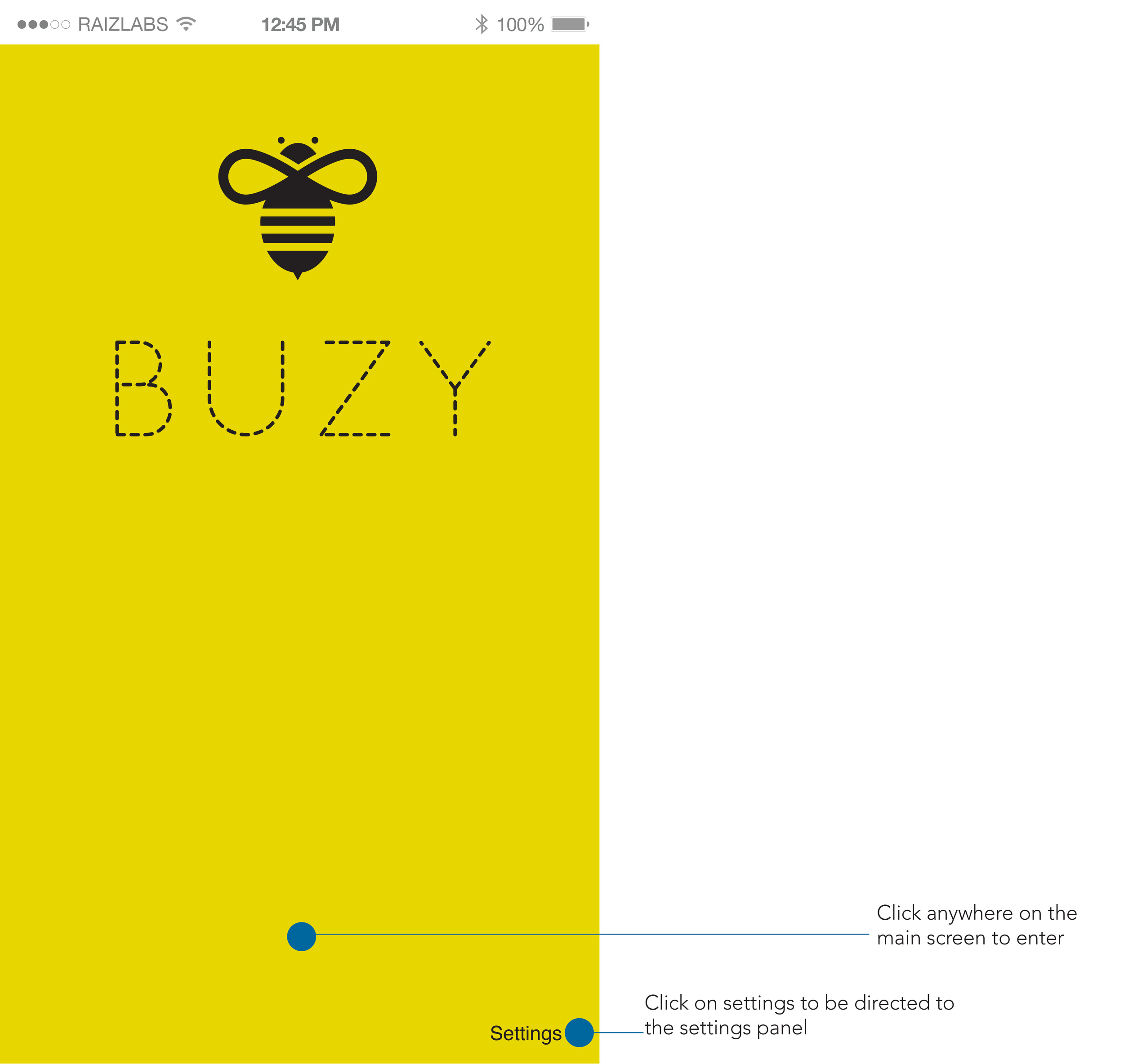
Buzy Application Design
What
The goal for Buzy was to create an app that could anticipate the environment of the location before going. I.e. how "buzy" a restaurant or cafe is currently. This was a theoretical application design project where I learned about UX/UX, guerrilla testing, peer reviews, wireframing, Sketch, and InVision.
Problem
As a student, I began to consider an application that I would like to have and would need. When I consider my study habits, I realize that I work best in coffee shops. The issue that I often run into at these coffee shops is knowing which location is least crowded, has available outlets to plug in my devices, and has ideal parking. My problem to solve for this app would be to determine beforehand all of these factors and consider a wider audience.
Project Scope
Art Direction
Asset Management
Brand Strategy
Brand System
Custom Illustrations
Guerrilla Testing
Industry Research
UX + UI
Wire Framing
Storyboarding
Process
For a more in-depth analysis please refer to my case study: Full Case Study Here It provides information about how I approached the research and thinking behind the concept of Buzy.
Once the wire-framing, student testing, and feedback were provided, I could begin to consider what the look and feel would be. Since my audience focused more on the younger generation, the concept for branding was fun, bright, playful and modern. Simple to use, easy to look at
Once the UX/UI was addressed, amended, and the design of the application was explored, I could determine how I would showcase the application and give an interactive experience. Development was not an option just yet, but understanding how the application would respond was crucial.
The Solution
Overall, it was really interesting to come up with a problem, and address the solution in a practical digital way. Though the application has not been entirely coded, here is the link to the interactive PDF which considers the audience, research, storyline, and design: Link to the App Interactive PDF
What I learned
From this project, I grew immensely in terms of understanding what user experience looks like, as well as the importance of user testing. I understand how difficult it is to develop an application, and I also learned how important it is to understand the audience and the needs that the application would address. I got to experience for the first time guerilla testing and how beneficial this can be for understanding how people interact with the application. I also gained new program skill sets in both Sketch and InVision which provide such useful tools for building the application, as well as presenting it in a realistic way. Overall, learning more about how I can design an application to resolve a problem and the UX/UI required to accomplish this was a very rewarding experience.


