Privy
What
Privy is a private equity application for buyers and sellers. It’s an actionable private equity deal flow that anyone can use.
Problem
The founders of Privy had the idea and industry knowledge, but they lacked an application design. We worked with their team to understand their audience, their goal, and their users to best inform the design and user experience.
Process
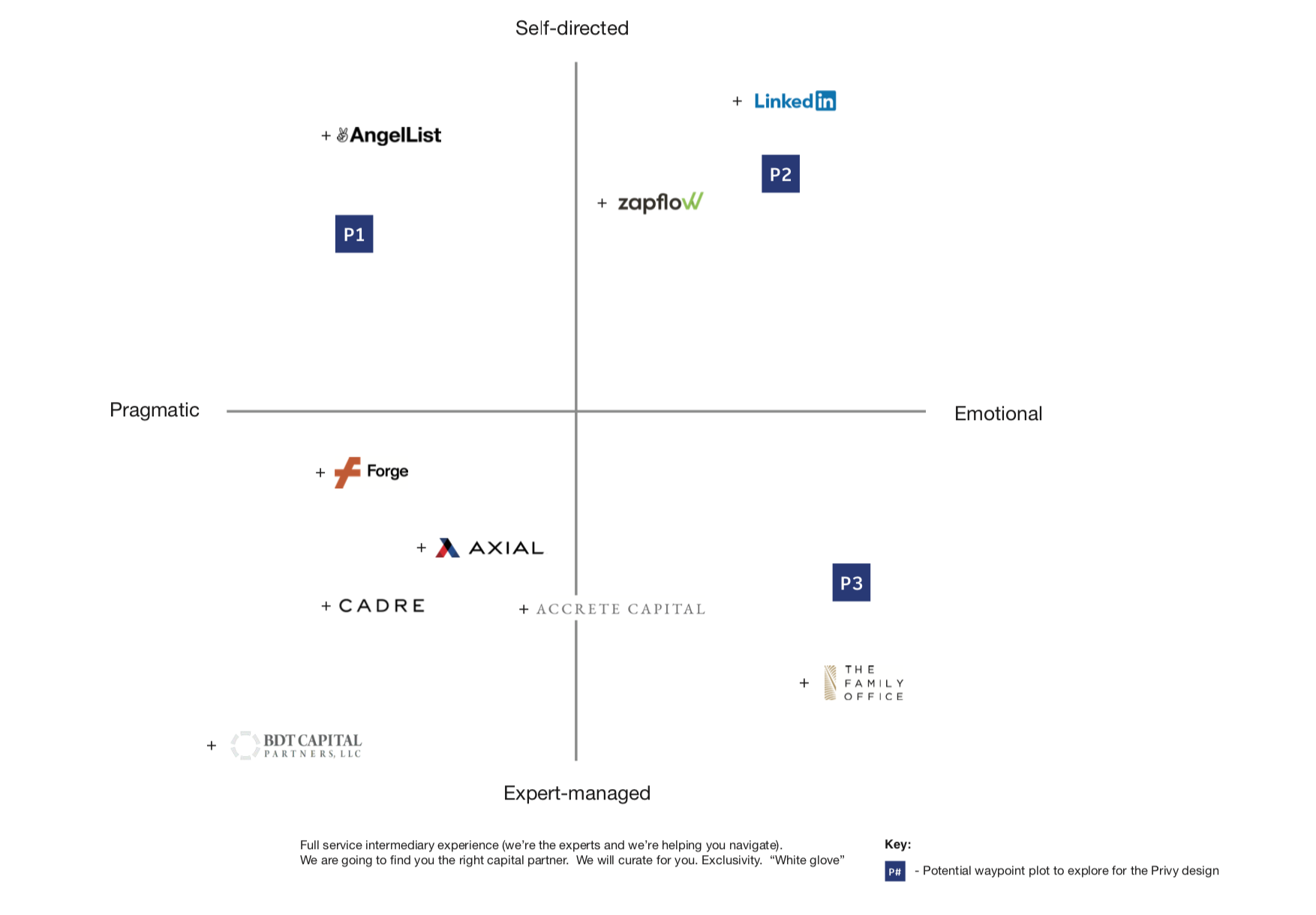
We created a waypoint system for the Privy team to map. This tool was used for us to better understand their users and also determine three distinct coordinates on the map, and design based on these parameters. Our goal was to show them three different examples and to push the options in order to find a direction quickly that fit into their brand image. The waypoints on the X-axis were, pragmatic and emotional. Pragmatic being more rigid, blunt, and less educational. Emotional being more light-hearted, warm, and approachable. The Y-axis was made up of, self-directed and expert-managed. So was this user guiding the process, or was the app managing the situation expertly? How much control was there? With these axis considered, the team plotted three points for us to design within.
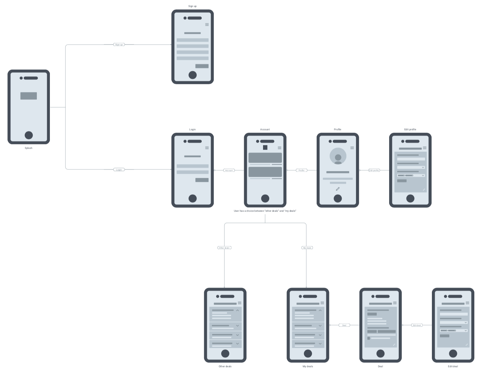
Once the design plots were determined, it was time to discuss the application architecture. How would the user go about the app, and what important systems were to be considered? We quickly came up with a user-flow that worked for the team and then we were off to design.
Project Scope
Art Direction
Brand System
User Persona Development
Wire-framing
Application Guidelines
Front End Development
Industry Research
UX + Visual Design
Solution
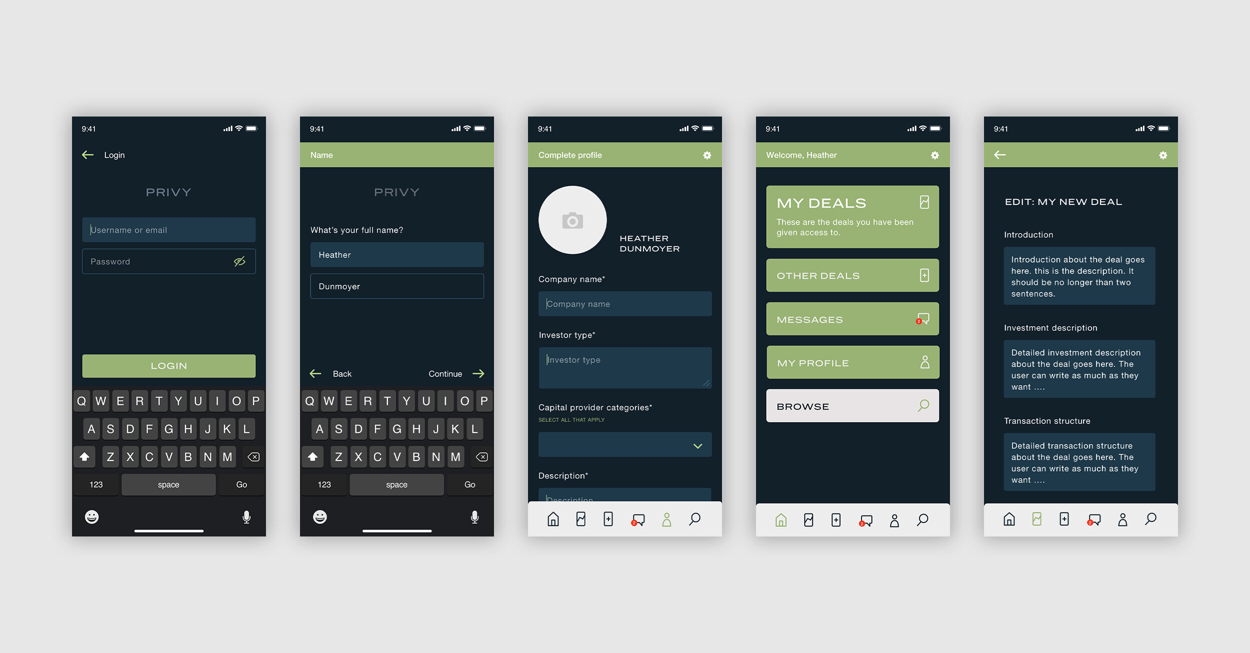
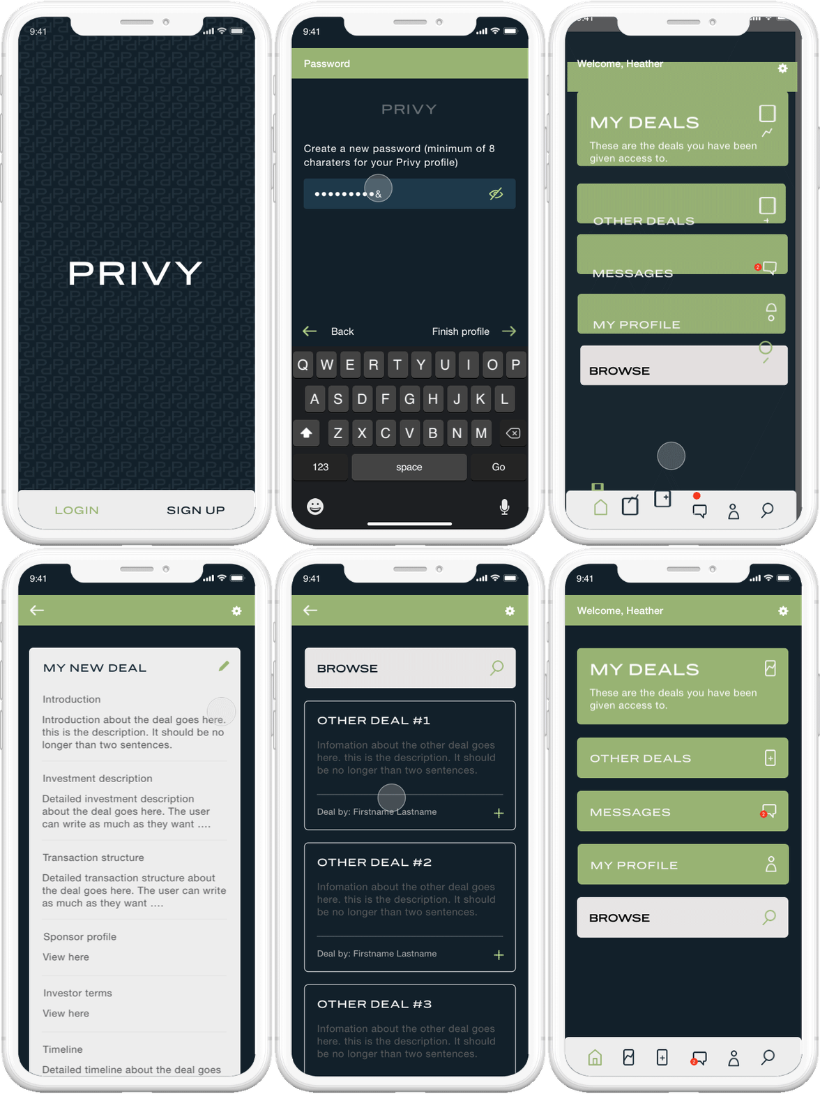
I was able to come up with the three different types of designs base don the plots. Once we received feedback, it was rapidly clear, Privy was to be more self-directed and emotional. The design is clean, modern, easy-to-use and friendly. This project was to focus on building out the assets for the application, create a style guide, and then hand this off to an external dev team. It was a unique challenge to consider all assets or questions that might arise when developing the application. This lead to thorough research and scrutiny on the handoff.


